Your presentation slides have the power to make or break the talk you’re giving
People will talk about your presentation so let's make sure they're saying all good things
What makes a good presentation slide?
At the end of Jan I went to a conference in London; it was a great way to learn and I loved spending the day with some fab freelance friends.
I think I must have watched about 5 different talks through the day and the presentation slides almost killed me. OK I exaggerate, but the majority of them were pretty horrendous. And that's not just my opinion as a designer; it's something that people mentioned to me during the day too.
Regardless of whether you’re pitching for investment or presenting to a room full of bright-eyed new business owners your presentations need to be well thought out and well-designed.
I know you’re probably thinking “but does it really matter?” Yes it really does.
Why you need well-designed presentation slides
A well-designed presentation supports your brand
A well-designed presentation creates credibility
Design should be simple; less is more
Use (the right) design to create an impact
Clarity will get your message across easily
Accessibility in your design
1. A well-designed presentation supports your brand (of course this had to be no 1 on my list)
Your presentation slides are a great way to increase recognition for your brand and confidence in your business! Using your logo and your brand fonts/colours makes it easier for your audience to associate your presentation with your company. This’ll help with brand awareness and increase recognition over time. (You can read more about the power of a strong brand here). Presentation slides that tie into your branding also show you’ve taken the time and effort to create something that looks good.
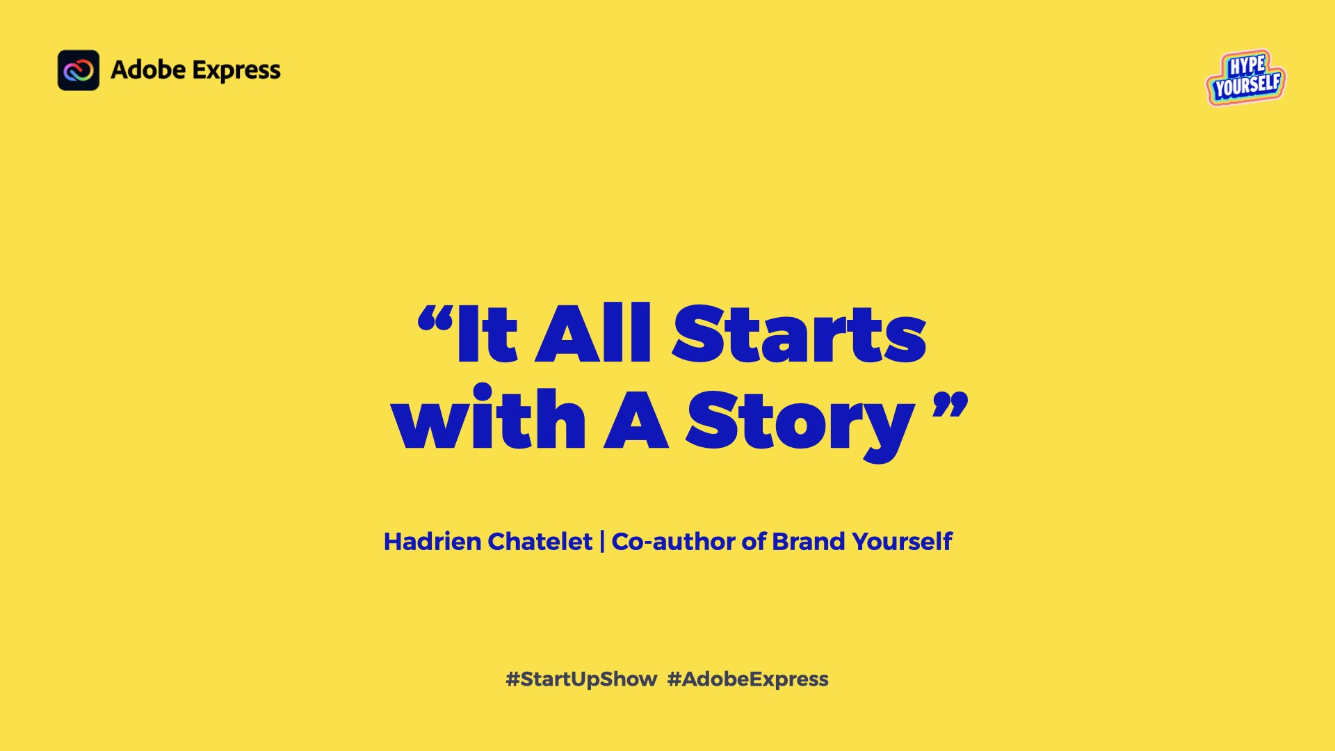
Here's a really great example of a presentation slide used at one of the talks I went to - and I chose this one from a random point in the talk.
The minute Lucy's talk started her slides were completely on brand. Have a look at her website and let me know if you disagree?
2. A well-designed presentation creates credibility
Nicely designed slides show you know what you’re talking about. This’ll lead to greater trust and belief in the message you’re trying to get across. And your audience will be more likely to take you seriously when you show that you care about the details; that includes design.
3. Design should be simple; less is more
If you add so much to each slide that you’re using them as show notes, you’re doing it wrong! Your audience will end up reading your presentation instead of paying attention to YOU; they’ll lose focus and then you’ve just lost them haven’t you!
Here's a photo I took at one of the talks - I'm not going to name names so I've cut the business name off the bottom. The content of this entire presentation was VERY important. But the design and layout of each slide was different so I (and others) lost focus. Don't get me started on the alignment of anything here!
4. Use (the right) design to create an impact
Your presentation will either capture attention from your audience immediately, or it’ll turn them off. A well-designed presentation will leave a lasting first impression on the audience, helping to engage and hold their attention. Just like a well thought out brand identity, your presentation will be memorable. Do you want it to create the right or wrong impression?
5. Clarity will get your message across easily
A well-designed presentation is clear and concise, making it easy for the audience to understand and retain the information you’re presenting to them. The people in your audience need to be able to pay attention to your slides at the same time as paying attention to what you’re saying. People tend to scan slides (and take photos) so having well designed slides means your message comes across clearly.
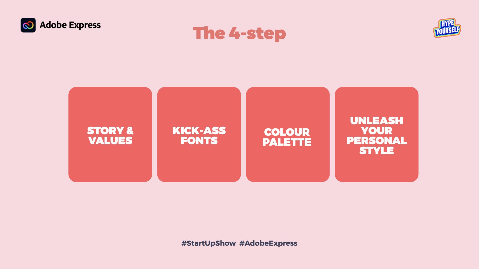
Here's another great example from from Lucy's talk.
She spoke at length about this 4 step process, but I love that the slide shows just the name of each step rather than including paragraphs of text with each point.
6. Accessibility in your design
This one was pointed out to me on LinkedIn so a huge thank you to Rowan of Vivid Peaks Copywriting. Poorly designed slides could be a challenge for people in your audience; designing your slides with visual, auditory, and cognitive impairments in mind means that everyone, regardless of ability, can (hopefully) benefit and learn from your presentation.
How important are your visuals really?
Humans are visual creatures. Over 90% of the information transmitted to our brains is visual (source: Elearning Industry).
Having well-designed presentation slides will seriously up your game and leave the right lasting impression on your audience. Branding and design will reel people in; your content and talk will keep them engaged.
So whether you're pitching for investment or teaching something to your audience, don't skimp on the design!
And now you know the why, would you like to know the how? I’ve written a short and sweet e-book so you can learn how - send me an email if you’d like a copy of it!
Want to work with me?
You can find out a bit more about how I work with clients, why I do what I do or tell me about your brand identity design related tales I’d love to hear from you!
And if you want to find out more about how I can help you communicate your message with your audience, or if we haven’t been in touch for a while and you’d like to reconnect drop me a line, I would love to catch up! You can email me on bhavini@b81designs.com.
I'll be posting more blogs, and case studies so be sure to check back here soon. Follow me on social media for regular updates, handy hints, tips and design inspiration! See you soon!


